2 What do we know about recent climate change?
2.2 Records of the Earth's temperature
To put the temperature records reported by the IPCC in context, we start with a longer-term geological perspective on the Earth's GMST.
2.2.1 Long-term rhythms in the climate
The instrumental record referred to above is based on direct temperature measurements (using thermometers), and extends back only 150 years or so. Temperatures further back in time are reconstructed from a variety of proxy data. These include historical documents, together with natural archives of climate-sensitive phenomena, such as the growth or retreat of glaciers, tree rings, corals, sediments and ice cores (see Box 7). In general, the proxy data record becomes more sparse and more imprecise the further back in time we go. Nevertheless, it has proved possible to produce a reasonably reliable reconstruction of how global temperature has varied throughout most of the Earth's history; this is known as the palaeoclimate record (from the Greek palaios for ‘ancient’).
Box 7 Proxy data: ways to reconstruct past climates (Stokstad, 2001)
People have recorded the vicissitudes of climate and their impact on human affairs for centuries, so archaeological inscriptions and historical documents (diaries, ship's logs, etc.) are a valuable, if somewhat anecdotal, source of climate information. In addition, a variety of techniques – ranging from counting pollen types in lake sediments to analysis of isotope ratios in ancient ice (recall Figure 15)– yields rich, if sometimes ambiguous, climate information from many natural sources.
For example, dendroclimatology depends on the fact that trees in many parts of the world experience an annual growth cycle (Figure 22). Each year's growth (the thickness and/or density of a ring) depends on the local temperature and moisture conditions, creating a unique record that can then be matched with overlapping records from other trees to produce longer time series. Annual records typically go back 500 to 700 years. In a few cases, the preservation of fossil trees has allowed continuous records from 11 000 years ago to the present to be constructed.

Figure 22: Unlocking the secrets of past climates. Each year, a growing tree produces a layer of new cells beneath the bark. If the tree is felled and the trunk examined (or if a core is taken), the growth pattern from year to year appears as a series of rings.
In a similar way, cyclical responses lead to annual banding in corals, which can provide information about sea-surface temperatures, sea level and other ocean conditions – typically back to some 400 years ago.
Layered sediments on lake and ocean floors are another rich source. The types of pollen trapped in lake sediments reveal shifting patterns of vegetation, and thus indirect information about temperature and moisture conditions. Records can go back some 100 000 years. In marine sediments, analysis of microfossils can provide data on seawater temperature and salinity (salt content), atmospheric CO2 and ocean circulation. Less common deposits of coarse debris can point to the break up of ice sheets and the release of detritus from melting icebergs. Marine sediments provide information from time periods ranging from 20 000 years to 180 million years ago.
Finally, long ice cores drilled out of the Greenland and Antarctic ice sheets yield a wealth of information. For example, past temperatures can be determined by oxygen isotope analysis . 99% of the oxygen on Earth is the isotope 16O; most of the rest is 18O. Because water molecules containing the different isotopes (i.e. H2 16O and H2 18O) have slightly different physical properties, it turns out that the 18O/16O ratio in ice locked up on land is affected by the ambient temperature at the time when the ice formed. Thus, fluctuations in the oxygen isotope ratio in an ice core provide a proxy for temperature changes back through time (see Figure 23). The cores also include atmospheric fallout such as wind-blown dust, volcanic ash, pollen, etc. – along with trapped air bubbles (as discussed in Section 1.6).
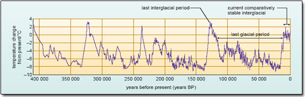
Figure 23: Temperature changes over the past 400 000 years reconstructed from the Vostok ice core, the longest continuous ice-core record to date.
This record tells us, for example, that the Earth entered into the most recent comparatively cold period of its history (known as the Pleistocene Ice Age) around 2.6 million years ago. On a geological time-scale, these Ice Ages are relatively rare, covering only 2–3% of the history of our planet. The characteristic feature of the current one (and there is no reason to suppose that it is finished) is evident in Figure 23. Drilled in Antarctica, the Vostok ice core provides a temperature record that goes back several hundreds of thousands of years. Beyond about 10 000 years ago, it tells a story of an unstable climate oscillating between short warm interglacial periods and longer cold glacial periods about every 100 000 years – with global temperatures varying by as much as 5 to 8 °C – interspersed by many more short-term fluctuations.
By contrast, global temperatures over the last 10 000 years or so seem to have been much less variable, fluctuating by little more than one or two degrees. In short, the interglacial period in which we live, known as the Holocene, appears (on available evidence) to have provided the longest period of relatively stable global climate for at least 400 000 years. It is almost certainly no coincidence that this is also when many human societies developed agriculture and when the beginnings of modern civilisations occurred. We now shift the focus to the more recent past – the period during which human population growth and the coming of the industrial age began to make their mark on the composition of the atmosphere.
2.2.2 Temperature changes over the past millennium
One of the most striking images in the IPCC TAR is reproduced (in adapted form) in Figure 24. Together, these two temperature records tell a compelling story, crystallised in our earlier quotes from the SPM. So let's just pause to take a closer look at each of them.
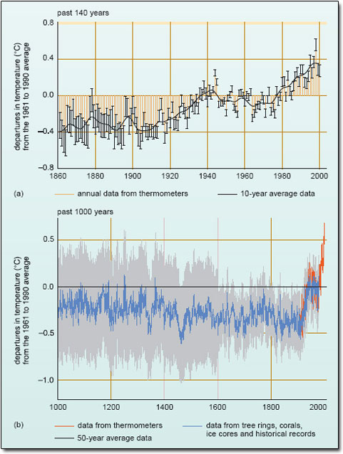
Figure 24: Variations of the mean surface temperature: (a) globally over the period 1860–2000; (b) in the Northern Hemisphere over the past 1000 years. In both cases, data are plotted as ‘deviations’ from the mean value, or climatological average , for a particular 30-year period (here 1961–1990). This is a convention widely used by climatologists. In (a), error bars are attached to values for each individual year and don't always overlap with the ‘smoothed’ curve (black line). (Source: IPCC, 2001a.)
The instrumental record of the Earth's GMST
Immediately striking in Figure 24a are the marked fluctuations in global temperature from year to year. Equally, the averaging that produced the smoothed curve brings out considerable variability over periods of a decade or so as well. Set against this ‘background noise’ however, there clearly has been a general warming over the past 140 years.
Use the smoothed curve in Figure 24a to estimate the overall warming.
The curve starts about 0.40°C below the climatological average, and ends up about 0.35°C above it. So the overall warming amounts to some {0.35− (−0.40)}°C=0.75°C.
Before engaging further with the details of that trend, it is pertinent to ask about the uncertainties in the instrumental record, indicated by the error bars attached to the annual data. In practice, it is a complex and time-consuming business to ‘aggregate’ weather observations (be they on land or at sea) from around the world into global averages, and hence construct the kind of climatological time series shown in Figure 24a. Uncertainty can arise for various reasons, collected here under two broad headings.
- Sampling errors Even today, land-based weather stations tend to be concentrated in heavily populated regions of the industrialised world (Figure 25). More remote areas and large parts of the ocean are often poorly monitored – and this was even more true in the past. For example, until fairly recently most marine observations were made by ‘ships of opportunity’. An uneven spatial coverage effectively ‘samples’ the Earth's temperature non-uniformly. And as the spatial coverage changes over time, spurious trends and biases can become embedded in the historical record.
- Data reliability Apparent jumps or trends in the record from a particular station may be an artefact of some local effect. Changes in instrumentation or observing times, or in precise location or the local environment, can all affect the reliability of the data. An important example here is the spurious warming associated with the growth of towns and cities around (or near) a weather station – the so-called ‘urban heat island effect’.
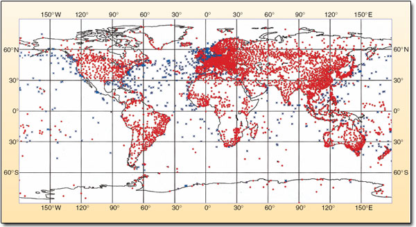
Figure 25: Today, the WMO (World Meteorological Organisation) oversees the free international exchange of meteorological data, as well as promoting properly taken observations from a worldwide network of land and marine monitoring stations, including moored buoys and fixed platforms at sea (e.g. oil rigs). The map shows the distribution of these various surface stations.
Figure 24a is the result of a painstaking effort to screen the available records (both land-based and marine) – applying corrections where possible or simply rejecting unreliable data – and then to estimate and quantify the uncertainty in the final global averages. Thus, the top (or bottom) of each little orange bar represents the central or ‘best’ estimate for each year's reconstructed temperature. The error bars represent the 95% confidence interval or range; i.e. there is a 95% probability that the ‘true’ value lies within this range (see Box 8).
Box 8 Measures of uncertainty
Probabilistic statements are based on a ‘formal’ statistical analysis of observational data (e.g. the temperature measurements that feed into estimates of GMST). Where IPCC scientists were unable to estimate and quantify the uncertainties in their conclusions in this way, they adopted a ‘ likelihood’ language, originally proposed by Moss and Schneider. This was intended to convey their level of confidence in the validity of a conclusion, based on their collective subjective judgement. This is fairly unfamiliar territory for most scientists, but reflects the ‘policy relevant’ context in which the IPCC operates. In other words, if the expert community does not attempt to make such judgements, then someone else will! The translation is as follows:
- virtually certain: greater than 99% probability that a conclusion or finding is valid
- very likely: 90–99% probability
- likely: 66–90% probability
- medium likelihood: 33–66% probability
- unlikely: 10–33% probability
- very unlikely: 1–10% probability
- exceptionally unlikely: less than 1% probability.
By applying a standard statistical technique (rather than the rough-and-ready judgement ‘by eye’ that you used above), the IPCC concluded (IPCC, 2001a): ‘Over the 20th century, the increase [in GMST] has been 0.6 ± 0.2°C’.
The 95% confidence level applies to this statement as well. Describe in your own words what this means.
The central (or best) estimate of the temperature rise is 0.6°C; there is a 95% probability that it lies between 0.4°C and 0.8°C, and only a 5% probability that it is less than 0.4°C or greater than 0.8°C.
Averaged over the whole century, this estimate translates into a rate of warming of 0.06 °C per decade. However, the smoothed curve in Figure 24a makes it abundantly clear that there were two periods of sustained warming and two periods when the GMST fluctuated without any overall warming or cooling trend. Deciding where the fluctuations end and the warming begins is open to debate. The IPCC's verdict? Most of the warming occurred in the periods 1910 to 1945 and since 1976. The rate of warming for both periods is about 0.15°C per decade, more than twice the century-long average.
On a regional scale, the most recent warming has been almost global in extent (i.e. it has been happening almost everywhere), but is most marked over the continental landmasses at mid- and high latitudes in the Northern Hemisphere.
And there are some notable ‘hot spots’, especially in the coldest regions of the far northern Arctic fringe. For the past few decades, parts of Siberia, Alaska and Canada have been warming much faster than the global average rate. In Point Barrow, Alaska, for instance, the annual mean temperature has gone up by 2.3°C over the past 30 years. Meanwhile, at the other end of the planet, the Antarctic peninsula (the long finger of land that sticks up towards the southern tip of South America in Figure 25) has experienced a warming of about 2.5°C since 1950; average winter temperatures are up by nearly 5°C.
Now have another look at the second bullet point in our opening remarks to this chapter. Given the ‘likelihood’ language adopted in the TAR (Box 8) and the information in Figure 24a, does this seem a reasonable conclusion?
Yes. It does indeed seem ‘very likely’ (90–99% probability) that the 1990s was the warmest decade (and 1998 the warmest year) in the instrumental record.
In the early years of the 21st century, there is no immediate sign that global temperatures have taken a downturn. At the time of writing (2006), 2002, 2003 and 2004 stand as the second, third and fourth warmest years, respectively, in the instrumental record. Indeed, the top ten warmest years have all occurred since 1990.
Question 8
In its second major report (published in 1996), the IPCC assessed the instrumental record up to (and including) 1994. At that stage, the Panel's best estimate of the increase in GMST since the late 19th century was 0.45°C – the same as its original estimate (in 1990). How does this compare with the more recent estimate in the TAR, and what is likely to be the main reason for the difference?
Answer
The more recent estimate (0.6°C) is 0.15°C larger than that estimated in the IPCC's second report for the period up to 1994 (0.45°C), mainly due to the exceptional warmth of the additional years (1995 to 2000; see Figure 24a). [According to the IPCC TAR, the recent estimate also involved improved methods of processing the data.]
The proxy data record for the past millennium
To establish whether 20th century warming is unusual, we need to place it in the context of longer-term climate variability during the Holocene. Because of the scarcity of proxy data from the Southern Hemisphere, the IPCC TAR focused on reviewing a number of reconstructions of the average surface temperature for the Northern Hemisphere, not the whole globe. Figure 24b is the record they endorsed as the most reliable guide to how temperatures averaged across the whole hemisphere changed during the course of the last 1000 years. Like the instrumental record (shown in red), the proxy record includes annual data and a smoothed curve that brings out variability on a time-scale of several decades. The grey region is the 95% confidence range in the annual data. Note that the uncertainty is much greater than for the period covered by the instrumental record, and increases further back in time.
How would you summarise, in a sentence, the overall long-term trend brought out by the smoothed curve in Figure 24b?
There is no one ‘correct’ answer to a question like this, and if you get a chance to discuss the figure with other students, don't be surprised if you come up with slightly different descriptions.
Here is the formulation the IPCC came up with (IPCC, 2001a):
The long-term hemispheric trend is best described as a modest and irregular cooling from AD 1000 to around 1850–1900, followed by an abrupt 20th century warming.
This description and the record it is based on challenge a widely held belief. Conventional wisdom has it that the Northern Hemisphere experienced a ‘Medieval Warm Period’ (roughly the 11th to 14th centuries) – when vineyards flourished in southern Britain and the Vikings colonised Greenland, for example – followed by a ‘Little Ice Age’ that lasted well into the 19th century (Figure 26); icebergs became common off Norway, ice fairs were sometimes held in London on the frozen River Thames in winter, and advancing mountain glaciers crushed entire villages in the Alps.
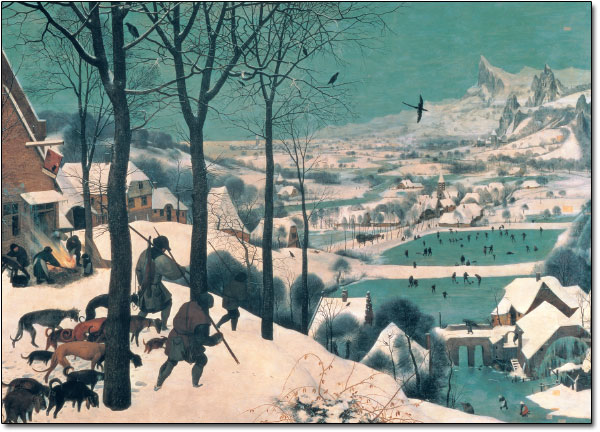
Figure 26: ‘Hunters in the snow’, an imaginary landscape painted by Peter Bruegel the Elder in February 1565, during the first of the great winters of the next 200 years. This seems to have been the most severe period of the Little Ice Age in Europe.
There is no doubt that the landmasses bordering the northern North Atlantic (NE America, Iceland, Greenland and NW Europe) did experience more genial climes during the Middle Ages, followed by several centuries of a generally colder regime than now. These climate changes were often pronounced, but they did not always occur at the same time in different regions. As a result, when conditions are averaged over the whole hemisphere, the changes no longer appear exceptional. In other words, current evidence does not support hemisphere-wide synchronous periods of anomalous warmth or cold over this timeframe. Such periods appear to have been mainly a regional phenomenon, and are thought to have been associated with changes in the state of the atmosphere-ocean system centred on the northern North Atlantic. Natural fluctuations such as this occur on almost all time-scales. They can have a profound effect on climate on local or regional scales, but are greatly diminished in their influence on hemispheric or global mean temperatures.
The shape marked out by the smoothed curve in Figure 24b has seen this reconstruction dubbed the ‘hockey stick’, especially in the US (think of the graph turned through 90°). Its significance is that the warmth of the last few decades appears to be unprecedented in this 1000-year period; i.e. it rises above the range of natural variability, and exceeds the uncertainty in the proxy data record (at the 95% confidence level).
Here is a reminder of one of the quotes from the beginning of the chapter:
New analyses of proxy data for the Northern Hemisphere indicate that the increase in temperature in the 20th century is likely to have been the largest of any century during the past 1000 years. It is also likely that […] the 1990s was the warmest decade and 1998 the warmest year [of the millennium].
What do you make of the language used there?
It is more cautious. Use of the word ‘likely’ implies a 66–90% probability (Box 8) that the statements are true (i.e. a greater than 2 in 3 probability), based on the collective judgement of the IPCC scientists. Presumably this acknowledges residual concerns about the very large uncertainty associated with proxy data records.
Bearing in mind that every dot and comma in the SPM is pored over, this is still a pretty strong conclusion – the more so, since it was the first time the IPCC had put the warmth of the late 20th century in the context of changes over a millennial time-scale. Detection of a warming ‘signal’ above the ‘noise’ of natural variability does not prove that human activity is the probable cause (the question of attribution is taken up in Section 3.5), but it is an important first step in that process. As a consequence, it is fraught with political significance.