5 Bar charts and histograms
5.1 Bar charts
5.1.1 What is a bar chart?
A bar chart is a diagram in which the numerical values of the different variables are represented by the height or length of lines or rectangles of equal width. The bars or lines can be drawn vertically or horizontally.
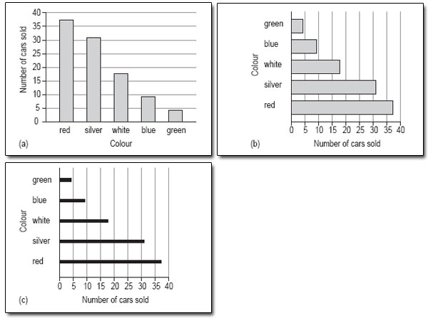
Figure 4 shows three bar charts illustrating the same data: the first has vertical bars, the second horizontal bars and the third has lines instead of bars.
5.1.2 When are bar charts used?
A bar chart is a good method of representation if you want to illustrate a set of data in a way that is as easy to understand as it is simple to read. In general, a bar chart should be used for data that can be counted so, for example, we could use a bar chart to show the number of families with 0, 1, 2 or more children. A bar chart could also be used to show how many people in one area use each of the different modes of transport to get to work.
Bar charts are very useful for comparing two or more sets of data, as you will see later. For example, the popularity of different modes of transport in two cities, or from one year to the next.
5.1.3 When is a bar chart not a good format to use?
A bar chart is not the best way to show the link or mathematical relationship between two sets of data, for this you would use a line graph.
5.1.4 How do I draw a bar chart?
First, you need to decide what it is you want your chart to illustrate. This may be governed by the data you have access to or you might need to collect the data yourself. Then the process is as below.
- Decide on a clear title. The title should be a brief description of the data that you want to show.
- Identify how many bars are needed. The bars correspond to the number of categories you have. For instance, if you are looking at modes of transport then you might need six bars covering car, bus, train, motorbike, cycle or walk. A chart about the number of children per family might have eight bars for 0, 1,2, 3, 4, 5, 6 and 7 or more. Bar charts can be drawn using either horizontal or vertical rectangles or lines. There are no rules governing which to use, but if the labels for the categories are quite long, they will be easier to read if the bars are on the vertical axis.
- Identify the scale you need for the other axis. Look at each category and decide which is the largest; the other axis has to go up to at least this value. You might also find it useful to check the value of the smallest category, so that you choose a scale to accommodate all the values. The scale should start at zero.
- Draw and label the two axes. The labels should be simple and as clear as possible. The units should also be shown, if appropriate.
- Add the bars. In a bar chart, strictly speaking, the bars should not touch; each one should be a separate rectangle. The gap between the rectangles or lines serves to show that the categories are distinct. You can use a solid line instead of a rectangle or bar, but you will not see this type of bar chart very often.
Activity 8
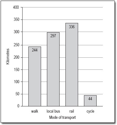
You should now follow our calculation of a bar chart from the information in Table 3.
Table 3: Average distance travelled per person per year in Paris
| Mode of transport | Km |
| walk | 244 |
| local bus | 297 |
| rail | 336 |
| cycle | 44 |
- Decide on a clear title. The title of Table 3 is appropriate.
- Identify how many bars are needed. There are four categories here, so you need four bars covering local bus, rail, cycle and walk. Given the short labels that will be needed for the bars, they could easily go on the horizontal axis.
- Identify the scale you need for the other axis. The scale to cover the distances is quite considerable: its highest value must be at least 336 and if possible, it should start at zero. If the bars are on the horizontal axis, the distance scale will be on the vertical axis.
- Draw and label the two axes. The labels are simply ‘Kilometres’ or ‘Km’ for the vertical axis and ‘Mode of transport’ for the horizontal axis.
- Add the bars. Remember to keep the bars separate and to label each one clearly (Figure 5).
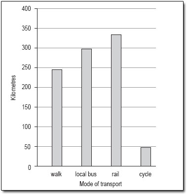
Discussion
This bar chart has been drawn using vertical bars or rectangles and with a vertical scale of 0–400 in steps of 50. The order of the bars reflects the order in which the categories were given in the data table, but many people would have chosen to put the bars in order of size, either descending or ascending. Generally speaking, unless the order is obvious from the categories, for example different years, it doesn't matter what order you use.
This bar chart could also be drawn with horizontal bars as in Figure 6.
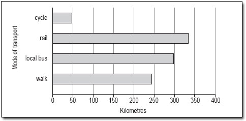
As you can see, it is not possible to use either of these charts to read off accurate figures for the number of miles travelled per person per year using any of the modes of transport shown. However, both charts give a good idea of the approximate number of miles travelled using each mode of transport and show how each of the modes of transport compare.
If it is important that the reader knows exactly what the distances are, either the scale should be such that the values can be read off accurately (this is not always practical or possible) or the values should be inserted at the end of each of the bars (Figure 7).
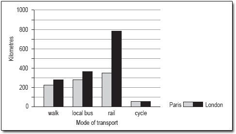
Bar charts can be used to compare two sets of data. Suppose you wanted to compare the data for average distances travelled per person per year in Paris with similar data for London (shown in Table 4).
Table 4: Average distance travelled per person per year in London
| Mode of transport | Km |
| walk | 281 |
| local bus | 353 |
| rail | 784 |
| cycle | 45 |
By following the same steps with the London data as with the Paris data, you could put both sets of bars on the same graph, but note that you would need to change the scale on the vertical axis to accommodate the much greater distance travelled by rail in London. The bar chart comparing the two sets of data looks like Figure 8.
Activity 9
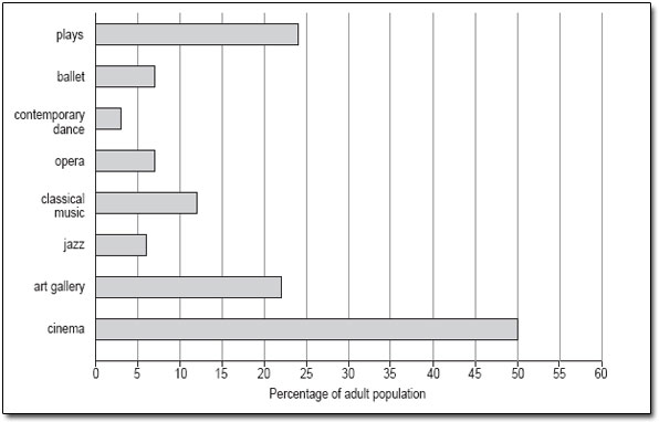
Now try drawing a bar chart using the same steps and the information in Table 5.
Table 5: Attendance at cultural events in Great Britain, 1993–94
| Cultural event | percentage of the adult population (attending regularly or occasionally) |
| plays | 24 |
| ballet | 7 |
| contemporary dance | 3 |
| opera | 7 |
| classical music | 12 |
| jazz | 6 |
| art gallery | 22 |
| cinema | 50 |
The most popular activity is going to the cinema; going to a play and visiting an art gallery are the next most popular activities.
Discussion
- Decide on a clear title. The title of this bar chart can be the same as that of Table 5 ‘Attendance at cultural events in Great Britain, 1993–94’.
- Identify how many bars are needed. There are eight categories listed in Table 5, so you need eight bars. We have chosen to draw this bar chart with horizontal bars as this makes it easier to read the different types of cultural event.
- Identify the scale you need for the other axis. The largest percentage is 50% and the smallest is 3%, so the scale on the horizontal axis could go from 0 to 60 in steps of 5.
- Draw and label the two axes. The horizontal axis should be labelled ‘Percentage of adult population’ but the vertical axis probably doesn't need a label, as the categories are self-explanatory.
- Add the bars. The bars for the categories can be given in the order listed or you could put them in order of popularity. Your bar chart should look like Figure 9.