2 Text
2.3 How to use text to good effect
Two aspects of the use of text are:
- How to ensure that your text is legible.
- How to write text that suits the medium.
We consider the first of these in this section. We do not cover how to write English that is appropriate for your particular readers here. However, it is important to ensure that your text does not contain words or expressions that may be unclear to your readers. You must select text that is meaningful to your users.
The bullet points below give guidelines for creating legible text for a UI. Some of these also apply to text on paper. This is a complex area and it is hard to develop guidelines that apply in all circumstances, so you should apply these with care, always taking into account the needs of your particular users. Do not forget that your users may have poor eyesight.
The term font is used widely in this context. A particular font is made up of two components: the typeface, such as Times New Roman or Arial, and the type size, which may be within a range such as 8 point to 72 point. There is some inconsistency in the literature concerning the definitions of font and typeface, but we feel these definitions are clear and useful.
When designing text for use on screen, you should be aware of the following points. (These points have been adapted from Götz (1998), Hartley (1994) and Rivlin et al. (1990).)
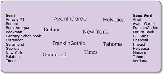
- Typeface. There are two main kinds of typeface: serif and sans serif. A serif is the finishing stroke at the end of a letter. See Figure 1. Sans serif typefaces are more suitable than serif typefaces for use on a screen: the resolution on screen is likely to be poorer than on paper, and the details of serif typefaces may be lost.
- Type size. Because of the poor resolution of most screens, reading from the screen usually requires a larger type size than reading from paper. (10 point is quite readable on paper but much less so on screen.) Typically, text between 11 and 14 point should be used. Headings should be between 14 and 20 point. Larger sizes are also better for all-day use, in workplaces such as call centres. It is possible to use smaller type sizes for areas of the screen that are read episodically, rather than continuously, such as menu bars.
- Letter spacing. Spacing between letters is important, as letters that are too close together (like this) or too far apart (l i k e t h i s) can reduce legibility.
- Interline spacing. The legibility of smaller type size can be improved by increasing the line spacing. The longer the line, the wider the line spacing should be (and the wider the line spacing, the longer the line can be). However, if the line spacing is too wide, then the lines may not be perceived as being related to each other.
- Line length. The maximum line length on a screen should be around 60 characters (or 8–12 words). This allows a meaningful unit of text to appear in most lines. You should avoid very short lines, as they fragment the text and it is more difficult to construct the meaning. You should avoid hyphenating words, because the reader has to stitch the word back together in his mind and this takes time and effort.
- Justification. Fully justified text (left- and right-justified) can create uneven gaps between the words on a page. It is usually best to left-justify blocks of text, as this gives a predictable place for the eyes to start from when they jump back to the beginning of the next line. Some argue that right margins should generally be left unjustified. If you are placing very short pieces of text next to other items on the screen (for example, putting captions on buttons or under icons), then you need to consider the relationship of the text to the item it belongs with. For instance, text on buttons usually looks neater if it is centred.
- Line endings. It is easier for the reader to follow a line if it has a distinct thought in it, so – where possible – line endings should coincide with grammatical boundaries. That is, a single line should contain a single idea or concept.
- Paragraph spacing. Paragraphs should be separated by blank lines, rather than by indentation of the first line.
Review question 1
Figure 2 above illustrates a screen containing some text. Use the guidelines to give a critique of this screen, explaining how it should be changed in order to make it more legible.
Comment
The following describes how we would modify the text:
- Typeface. A serif typeface (Times New Roman) was used in the original. We would change it to a sans serif typeface such as Arial.
- Type size. The type size is too small in the original; we would make it bigger.
- Letter spacing. This is reasonable.
- Interline spacing and line length. The lines are excessively long in the original; we would reduce the line length to around 60 characters. We would also increase the interline spacing to improve legibility.
- Line endings. Where possible, we would try to make line ends coincide with grammatical boundaries (i.e. a single idea or concept to each line of text). This may result in a considerable variation in the line length.
- Paragraph spacing. There is only one paragraph, but it is rather long, so we would split it into two.