6 Pie charts
6.1 What is a pie chart?
A pie chart is a circular chart (pie-shaped); it is split into segments to show percentages or the relative contributions of categories of data.
6.1.1 When are pie charts used?
A pie chart gives an immediate visual idea of the relative sizes of the shares of a whole. It is a good method of representation if you wish to compare a part of a group with the whole group. You could use a pie chart to show, say, advertising income, or market shares for different brands, or different types of sandwiches sold by a store. Pie charts don't give very detailed information, but they do give a quick overall impression of your results. You can add more information into pie charts by inserting figures into each segment of the chart, or by giving a separate table as a reference. Pie charts are also useful for comparing two different things. For example, the share of goods that different supermarkets sell.
6.1.2 When is a pie chart not a good format to use?
A pie chart is not a good format for showing increases and decreases, numbers in each category, or direct relationships between numbers where one set of numbers depend on another. In the last case, a line graph would be a better format to use.
6.1.3 How do I draw a pie chart?
You must have data for which you need to show the proportion of each category as a part of the whole. Then the process is as below.
- Collect the data so the number per category can be counted. In other words, decide on the data that you wish to represent and collect it all together in a format that shows shares of the whole.
- Decide on a clear title. The title should be a brief description of the data that you wish to show. For example, if you wish to show market share of brands of washing powder, you could call the pie chart ‘Percentage market share of named brands of washing powder in the UK in (date)’.
- Decide on the total number of categories. In other words, identify the categories that you will use. For example, with washing powder, there may be dozens of brands on the market, but most of the share of the market will be held by, say, half a dozen brands. Therefore, you might decide on those six along with a category called other. It depends very much on what you are trying to show, but pie charts are likely to be clearest with no more than eight categories.
-
Calculate the degree share in each category.
First, add up the total number of instances that you have. For example, in the case of washing powders, the total number of instances might be the number of units sold in a year, so the share of the whole for each category would be the number of units sold in that category. To calculate degree share, you need to divide the share that the category has by the total units and then multiply by 360 (there are 360 degrees (°) in a circle).
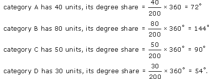
So, if there are 200 units in all, and:

- Make a final check that the number of degrees adds up to 360, then draw the pie chart.