2 What do we know about recent climate change?
2.5 A ‘collective picture of a warming world’
The observed increase in GMST may be the key global indicator of greenhouse warming, but it is far from being the only tangible sign of climate change during the 20th century. This brings us back to the first bullet point at the beginning of Section 2.1. Here, we take a brief look at the growing body of evidence that many different climate variables, as well as physical and biological systems around the world, have been affected by recent climate warming. The examples collected in Box 9 will give you a flavour of the sorts of reports that are now emerging from research programmes, though for the most part we focus on the overall picture summarised in the TAR.
Box 9 ‘Global warming: early warning signs’ (UCS, 2004)
- The Himalaya The Khumbu Glacier (on a popular climbing route to the summit of Mount Everest) has retreated by over 5 km since 1953. In the central and eastern Himalaya, glaciers are contracting at an average rate of 15 m per year, and could be gone by 2035 if this trend continues – with serious implications for populations who depend on glacial meltwater for drinking supplies, etc. Meanwhile, glacial lakes are swelling in Bhutan, increasing the risk of catastrophic flooding downstream.
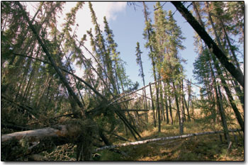
- Alaska, USA Most of the state is underlain by permafrost (permanently frozen soil). Thawing permafrost is causing the ground to subside (by 4–10 m in some places), undermining buildings, roads and other infrastructure. In some coastal areas, wave action is undermining cliffs softened by permafrost melt, increasing the risk of flooding for native communities. In the interior, forests of spruce and birch are taking on a ‘drunken’ appearance (Figure 28) on softening ground, and trees are dying as they succumb to waterlogged conditions.
- Chokoria Sundarbans, Bangladesh Rising sea levels have flooded about 7500 hectares of coastal mangrove forest during the past three decades. Global sea-level rise is aggravated by substantial deltaic subsidence in the area due mainly to human activities, such as reduced sediment supply following dam construction upstream for irrigation schemes, and the over-extraction of groundwater.
- United Kingdom The average flowering date of 385 British plant species has advanced by 41/2 days during the 1990s compared with the previous four decades; 16% of the species flowered 15 days earlier on average. Over a 20-year period (between 1968–72 and 1988–91), many bird species have extended the northern margins of their breeding ranges in the UK by an average of 19 km.
- Monteverde Cloud Forest, Costa Rica A reduction in dry-season mists due to warmer Pacific Ocean temperatures has been linked to the disappearance of 20 species of frogs and toads, upward shifts in the ranges of mountain birds, and declines in lizard populations.
- Antarctic peninsula Adélie penguin populations have shrunk by 33% over the past 25 years in response to declines in their winter sea-ice habitat. Adélies depend on sea ice as a resting and feeding platform. They are being replaced by gentoo penguins (a sub-Antarctic species that has begun to migrate towards the pole) which thrive in open water.
2.5.1 Physical and weather-related indicators
The indicators collected in Table 4 have been observed to change over large regions of the Earth during the 20th century. According to the TAR, there is now a good level of confidence that what is being recorded is the result of long-term change rather than short-term natural fluctuations. As we noted earlier (Section 2.2.2), the most recent period of warming has been almost global in extent, but particularly marked at high latitudes. So are the changes in Table 4 consistent with rising temperatures on both a regional and global scale?
Table 4: Twentieth century changes in the Earth's climate system.
| Weather indicators | Observed changes* |
| hot days/heat index† | increased (likely) |
| cold/frost days | decreased over most land areas during 20th century (very likely) |
| continental precipitation | increased by 5–10% over 20th century in Northern Hemisphere (very likely), although it has decreased in some regions (e.g. N and W Africa and parts of Mediterranean) |
| heavy precipitation events | increased at mid- and high northern latitudes (likely) |
| frequency and severity of drought | increased summer drying and associated incidence of drought in a few areas (likely); in recent decades, frequency and intensity of droughts have increased in parts of Asia and Africa |
| Physical indicators | Observed changes* |
| global-mean sea level | increased at average annual rate of 1–2 mm during 20th century |
| duration of ice cover on rivers and lakes | in mid- and high latitudes of Northern Hemisphere, decreased by 2 weeks during 20th century (very likely); many lakes now freeze later in autumn and thaw earlier in spring than in 19th century |
| Arctic sea-ice extent and thickness | thinned by 40% in recent decades in late summer (likely), and decreased in extent by 10–15% since 1950s in spring and summer |
| non-polar glaciers | widespread retreat during 20th century |
| snow cover | decreased in area by 10% since satellite observations began in 1960s (very likely) |
| permafrost | thawed, warmed and degraded in parts of polar and sub-polar regions |
* Levels of confidence (Box 8) where available are given in brackets.
† Heat index is a measure of how humidity acts along with high temperature to reduce the body's ability to cool itself.
Question 9
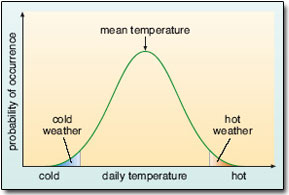
Figure 29: The distribution of daily temperatures around the mean value for a fictional location; see Question 9.
- (a) Figure 29 is a schematic representation of the distribution of daily temperatures (for a fictional location), scattered around the mean value according to a bell-shaped curve (a ‘normal’ distribution). At the tail ends of the distribution, the shaded areas represent the frequency of occurrence of unusually cold (left) and unusually hot (right) days. Suppose now that the mean temperature increases, but the distribution of temperatures around the mean (i.e. the shape of the curve) is unchanged. Sketch a second curve on Figure 29 to represent this ‘new’ climate, and use it to explain the first two weather-related entries in Table 4.
- (b) Drawing on your own experience, how might the shifts you identified in part (a) be expected to affect the human death-toll due to temperature extremes?
Answer
- (a) Figure 30 shows how an increase in mean temperature shifts the wholebell-shaped curve to the right. This reduces the frequency of unusually cold days (effectively to zero, in the somewhat exaggerated situation depicted to the left in Figure 30), and increases the frequency of unusually hot days (i.e. the area under the curve above a given temperature, to the right in Figure 30, is now much larger). This pattern is consistent with the first two entries in Table 4.
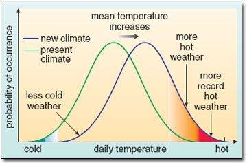
Figure 30: Schematic diagram showing the effect on extreme temperatures when the mean temperature increases.
- (b) Shifts of the kind identified in (a) could have both beneficial effects (reducing the number of cold-related deaths in winter in some regions) and adverse effects (increasing the number of deaths due to heat stress).
The remaining weather indicators in Table 4 (changes to precipitation and droughts) are less easy to link directly with a rise in GMST. However, they do bear directly on one of the major reasons for concern about regional climate change – a possible increase in extreme events
What about the changes in physical systems collected in Table 4? How might these be explained by rising temperatures?
The thinning and reduced extent of snow and ice cover over land and sea, and the melting of permafrost (Box 9), are all consistent with a warming of the climate. We might also expect that this warming has, in turn, contributed to the observed sea-level rise, both through direct warming and thermal expansion of seawater (Box 4; Section 1.3.4), and because the widespread melting of glaciers has added more water to the oceans.
Sea-level rise is one of the most feared aspects of global warming for island nations like Tuvalu, and for inhabitants of other low-lying parts of the planet. Yet keeping tabs on global mean sea level (the indicator included in Table 4) is, if anything, an even more complicated problem than monitoring the Earth's temperature – and again provides scope for disagreement and controversy among scientists.
Today, sea-levels are recorded by coastal tide gauges relative to a fixed benchmark on land. Averaged over a period of time (a year, say, to remove short-term effects due to waves, tides, weather conditions, etc.), the result is the local ‘mean sea level’. The difficulty in interpreting changes in mean sea level at a particular locality is that the land moves up and down as well. These vertical land movements can result from human activities (of the kind noted in connection with Bangladesh in Box 9), or more generally from natural causes – including tectonic processes (e.g. earthquakes) and very slow adjustments to major changes in ice-loading. For instance, the UK is still adjusting to the melting of ice at the end of the last glacial period; Scotland is rising a few mm a year and the south of England is sinking at a similar rate.
With this in mind, you can begin to see why it might be difficult to establish how global mean sea level (sea level averaged across the globe) has varied over the past century due solely to changes in the total volume of water in the oceans. It is this so-called ‘eustatic’ sea-level change that is linked to the climate-related factors identified above: thermal expansion of seawater and melting of land ice. All the historical records from tide gauges around the world measure only relative sea level. Not only is the spatial distribution of high-quality long-term records decidedly patchy, but individual records must also be adjusted for local land movements. This is a major source of uncertainty in the IPCC estimate included in Table 4.
What does this estimate imply about the total sea-level rise over the 20th century?
A rate of increase of 1–2 mm per year translates into a rise of 10–20 cm in the past 100 years.
But is this linked to 20th century climate warming? There is no independent evidence of this. All scientists can do is to estimate the contributions due to the observed warming, and see whether this matches the observed sea-level rise. The IPCC TAR estimates of the various temperature-linked contributions are collected in Table 5. Some background information on these estimates is given in Box 10. Read through that material, and then try Question 10.
Table 5: Estimated contributions to mean rate of sea-level rise (in mm y−1) from thermal expansion and land-ice change, averaged over the period 1910–1990. See Box 10 for significance of negative values, and entry for ‘long-term ice sheet adjustment’. Estimates for the observed rate of increase are included for comparison. (Source: IPCC, 2001a.)
| Low | Central estimate | High | |
| effects due to 20th century warming: | |||
| thermal expansion | 0.3 | 0.5 | 0.7 |
| glaciers | 0.2 | 0.3 | 0.4 |
| Greenland ice sheet | 0.0 | 0.05 | 0.1 |
| Antarctic ice sheet | −0.2 | −0.1 | 0.0 |
| long-term ice-sheet adjustment | 0.0 | 0.25 | 0.5 |
| total estimated | 0.3 | 1.0 | 1.7 |
| observed | 1.0 | 1.5 | 2.0 |
Box 10 Glaciers and ice sheets: how do they respond to climate warming?
The ice stored on land is usually carved up into two broad categories:
- Glaciers (and small ice caps) in mountainous areas (such as the Alps, Andes, Himalayas, etc.) and at high latitudes (in places like Iceland, Alaska, the Canadian Arctic and Scandinavia).
- The vast ice sheets in Greenland and Antarctica.
A glacier or ice sheet gains mass by accumulation of snow (which is gradually transformed to ice) and loses mass (known as ablation) mainly by melting at the surface or base, with subsequent runoff or evaporation of the meltwater. Bodies of ice have their own internal dynamics as well. Ice is deformed and flows within them – down a mountain for example, or in vast slow-moving ‘ice streams’ within the major ice sheets. Where a glacier or ice stream meets the sea, ice may be removed by the calving of icebergs or by discharge into a floating ice shelf (Figure 31), from which it is lost by basal melting and calving of icebergs.
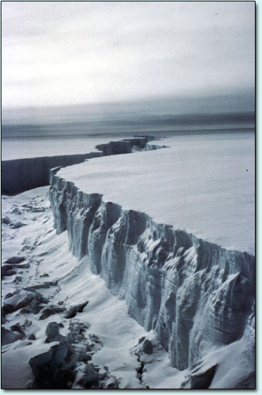
Figure 31: Virtually all ice shelves appear as huge walls of ice towering up to 40 m above the ocean. During the ‘heroic age’ of Antarctic exploration, the Ross Ice Shelf (the largest on the fringes of the continent) was known as the ‘Great Ice Barrier’.
How climate warming affects the total mass of an individual glacier or ice sheet depends on how the balance between accumulation (through snowfall) and ablation (through melting and discharge) responds to rising temperatures. On the face of it, this is a simple task of relating climate to accumulation and loss rates. In practice, numerous factors conspire to complicate this simple picture – not least the internal dynamics of the ice body.
Nevertheless, estimates of glacier and ice-sheet sensitivity to climate change have been made. On the basis of such estimates, a warmer climate is judged to result in a shrinkage of glaciers and the Greenland ice sheet, due to increased ablation. By contrast, Antarctic temperatures are currently so low that modest warming is expected to increase the overall mass of ice, due to increased accumulation accompanying a warmer atmosphere with increased moisture availability.
One final, very important complicating factor: the mass balance of a body of ice is essentially always attempting to catch up with climate. There is a time lag between climate change and the corresponding effect on a glacier or ice sheet, known as the response time.
In general, glaciers are not only pretty sensitive to climate change, they also have relatively short response times – typically 50 years or so, though the actual value varies depending on surface area, ice thickness and other factors. By contrast, changes in ice discharge from ice sheets have response times of 1000 years or more. Hence, it is likely that the Greenland and Antarctic ice sheets are still adjusting to their past history, especially the last glacial/interglacial transition. Table 5 includes an estimate of the contribution this long-term adjustment has made to 20th century sea-level rise.
Question 10
- (a) Using the central estimates in Table 5, work out the percentage contribution each factor has made to the mean rate of sea-level rise during the 20th century. Which of these factors appears to have made the major contribution?
- (b) In broad terms, are the estimated contributions from glaciers and the major ice sheets (due to 20th century warming) consistent with the background information in Box 10?
Answer
- (a) From the central estimates in Table 5, the major contribution to the observed rate of sea-level rise has come from the thermal expansion of seawater; this accounts for (0.5/1.5) × 100% = 33%. The next-largest contribution was due to melting glaciers (20%), followed by ‘long-term icesheet adjustment’ (17%; this is something that will continue to make a significant contribution in future), and then loss of ice from the Greenland ice sheet due to 20th century warming (just 3%).
- (b) The short answer is ‘yes’. According to Box 10, glaciers and the Greenland ice sheet are expected to lose mass in a warmer climate (greater ablation exceeds any gains from increased precipitation), but glaciers respond much more quickly. By contrast, the Antarctic ice sheet is expected to gain mass (due to increased precipitation), which is consistent with the negative entry in Table 5 (i.e. this has partly offset the loss of ice elsewhere).
Clearly, there are large uncertainties associated with the estimates collected in Table 5. This reflects a lack of sufficient observational data, inadequate understanding of the complex processes involved and shortcomings in the models used to produce some of these estimates. For instance, there is abundant evidence that the 20th century saw widespread glacier retreat across the globe: from the Arctic to Peru and New Zealand, from Switzerland to the Himalaya (Box 9) and the famed snows of Mount Kilimanjaro (Figure 32), vast ice fields and glaciers are shrinking. Yet it is still a difficult and uncertain business to quantify the loss of ice and assess its impact on the total volume of water in the world's oceans.
Meanwhile, the sheer physical size and inaccessibility of the ice sheets, the extreme climates and the occurrence of long periods of polar darkness have long rendered the acquisition of representative measurements extremely difficult. For example, the lack of suitable long-term data means there is no direct evidence that the whole Greenland ice sheet did actually shrink during the last 100 years; the estimate in Table 5 is based entirely on modelling studies driven by the observed warming over the ice sheet. However, satellite surveillance has been in place since 1990, and this short-term record does indicate a rapid thinning of the edges of the ice sheet.
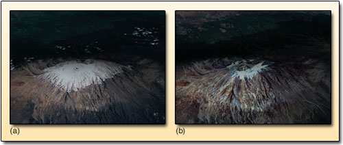
Figure 32: Satellite images of Mount Kilimanjaro, Tanzania, in (a) February 1993 and (b) February 2000. Around 82% of the snow and ice on the summit has disappeared since 1912, with about one-third melting since 1990. At current rates, scientists believe the ice cap could be gone by 2015, with important implications for tourism in Tanzania.
Summaries of available data for the whole of Antarctica have tended to find small positive net mass balances overall (in line with the estimate in Table 5), though with high degrees of uncertainty. But once again, there are signs that dramatic change is underway in some parts of the continent – not least the recent rapid collapse of several ice shelves around the Antarctic peninsula (Figure 33). Despite the newspaper headlines that accompany such an event, bear in mind that disintegration of a floating ice shelf does not, by itself, contribute to sea-level rise. (If you want to prove this for yourself, try floating ice cubes in a tumbler brimful of water to see if it overflows as they melt.) However, there is concern that, without ice shelves to act as dams, the continent's ice streams and glaciers might migrate faster towards the coast, ultimately contributing to sea-level rise. There are early indications that this may be happening in some parts of western Antarctica.
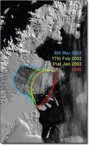
Figure 33: Satellite images tracking the spectacular collapse of part of the Larsen-B ice shelf on the eastern side of the Antarctic peninsula. In 2002, a huge area (about 3200 km2) of ice disintegrated in just 35 days. This was the largest collapse event of the last 30 years, bringing the total loss of ice extent from seven ice shelves to 17 500 km2 since 1974. The ice retreat is attributed to the region's strong warming trend (Section 2.2.2).
Now have another look at the estimates in Table 5. Taken together, do they tell the whole story of sea-level rise during the 20th century?
Probably not. The uncertainties are large, but (based on the central estimates) these climate-related contributions make up only some 67% of the observed rate of increase. However, the high estimate does account for the observed rise.
The IPCC identified the influence of some additional factors (not directly related to climate change, such as the extraction of groundwater), but were still left with a discrepancy between the estimated and observed rate of sea-level rise. Given the uncertainties that pervade this issue on all fronts, this is not altogether surprising. Nevertheless, the TAR concluded that ‘it is very likely [90–99% probability; Box 8] that the 20th century warming has contributed significantly to the observed sea-level rise’.
2.5.2 Environmental indicators
The notion of a link between climatic conditions and the behaviour of plants and animals (e.g. the growth of trees or coral) and the composition of natural communities or ecosystems (the type of vegetation in a given area, say) is fundamental to the use of proxy data to reconstruct past climates. Some examples of biological responses to recent climate change were included in Box 9. Here we should be wary of jumping to conclusions. Such changes involve complex living systems that can respond in complicated ways to a great variety of other pressures. Particular caution is necessary wherever records are of short duration, which in this context means less than a few decades.
Well aware of this stricture, and having conducted a literature survey of papers documenting biological and ecosystem changes on this sort of time-scale, the IPCC concluded (with high confidence) that the following observations are related to recent climate change:
- earlier flowering of plants, budding of trees, emergence of insects and egg-laying in birds and amphibians;
- lengthening of the growing season in mid- to high latitudes;
- shifts of plant and animal ranges to higher latitudes and higher altitudes;
- decline of some plant and animal populations.
You may well have noticed the kind of ‘phenological’ changes referred to in the first two points – shifts in the timing of life cycle events in plants and animals. Many biological phenomena (e.g. leaf bud burst and flowering in plants) cannot proceed until a minimum temperature has been reached over an adequate length of time. Changes in the timing of such events are easy to observe and monitor, and can provide sensitive indicators of climate change. Studies from various regions and ecosystem types tell a consistent story. For example, from Scandinavia to the Mediterranean and across North America, the growing season for plants has increased by 1–4 weeks over the past 50 years; spring comes earlier, but leaf fall in deciduous plants is delayed. Many animal life cycles also depend on temperature; in the UK, for instance, it seems that aphids now appear on average a week earlier than 25 years ago.
Migrating animals, especially butterflies and birds, benefit from keeping pace with the changes by arriving earlier in their summer habitat, so that food such as pollen and insects is available at the right time. Many are responding in just such a manner. However, there are signs that, in some cases, important inter-dependencies may be slipping ‘out of sync’ as the species involved respond to changed conditions in different ways; one example is included in Figure 34.
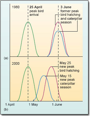
Figure 34: An example of emerging ‘desynchrony’ between bird behaviour (in migrating flycatchers) and insects (moth caterpillars), an important food source for their nestlings. Flycatchers that migrate from Africa to The Netherlands to breed still arrived at the same time (on average) in 2000 (b) as they did 20 years earlier (a). Because of higher temperatures, however, the caterpillars now emerge about 2 weeks earlier than before. The birds’ peak egg-hatching date has also shifted, but not enough. So nestlings now miss peak caterpillar emergence, and may go hungry. (In each part of the figure, the curves are schematic representations of the distribution of dates for each of the key events.)
Other plants and animals are adapting by extending their ranges – an example of the type of response referred to in the third bullet point above. Put simply, the underlying principle here is that the geographical limits of many plants and animals are determined very largely by temperature. In the Northern Hemisphere, for instance, it may be too cold for some species further north (or at higher altitudes), and too warm for other species further south (or at lower altitudes; alpine plants come to mind). Either way, shifts of the kind that appear to be underway (Box 9, points 4–6) are broadly consistent with a warmer climate.
Natural communities of plants and animals are in a constant state of change, and their composition is often strongly influenced by climatic factors. In a warmer climate, crucial interactions in the complicated dynamics of natural systems can be disrupted; some species will fare better than others. Those that are particularly sensitive to environmental change and/or unable to adapt in various ways (e.g. by colonising new areas) may suffer a decline in population (the final bullet point above), or be lost altogether (Box 9, point 5).
To sum up: the IPCC TAR is confident that a large proportion (over 80%) of the observed changes in these environmental indicators are in the direction consistent with well-established temperature relationships. In other words, there is a negligible probability that they happened by chance, given what is known about the various mechanisms of change in biological systems. Taken together with all the other indicators reviewed earlier in this section, they do indeed add up to a ‘collective picture of a warming world’ (IPCC, 2001a). At the same time, they serve as a portent of the kinds of changes that could lie ahead.
The threat of mass extinctions and loss of biodiversity regularly hits the headlines. We shall not attempt to grapple with the complexities of this issue – another potent and contested area of the climate change debate. Bear in mind, though, that ecological systems around the world are already under siege from countless other pressures linked with human activities: loss or fragmentation of habitat due to deforestation, urban and industrial development, demand for agricultural land, etc.; air and water pollution; overfishing and marine pollution; and so on. While some species may increase in abundance or range, climate change is likely to increase existing threats to other more vulnerable species, and some may literally have nowhere to go as the world warms up. Examples include plants and animals that thrive only in the coldest parts of the planet – at high latitudes and/or high altitudes. Like the Adélie penguins of Antarctica (Box 9), the polar bears, walrus and ringed seals of the far north all depend on Arctic sea ice in one way or another.